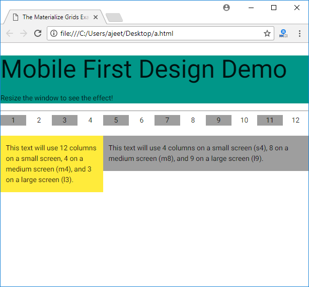
Materialize provides a standard 12 column fluid responsive grid system. It uses the row and column style classes to define rows and columns respectively.
| Index | Class name | Description |
|---|---|---|
| 1) | row | It is used to specify a padding-less container to be used for responsive columns. This class is mandatory for responsive classes to be fully responsive. |
| 2) | col | It is used to specify a column with sub-classes. |
Note: col contains several sub-classes for different types of screens.
Columns for Small Screen Devices
Following is a list of column-level styles for small screen devices, typically smartphones.
| Index | Class name | Description |
|---|---|---|
| 1) | s1 | It is used to define 1 of 12 columns with width as 08.33%. |
| 2) | s2 | It is used to define 2 of 12 columns with width as 16.66%. |
| 3) | s3 | It is used to define 3 of 12 columns with width as 25.00%. |
| 4) | s4 | It is used to define 4th of 12 columns with width as 33.33%. It contains s4, s5, s6, s7, s8, s9, s10, s11 |
| 12) | s12 | It is used to define 12th of 12 columns with width as 100%. Default class for small screen phones. |
Columns for Medium Size Screen Devices
See the list of column-level styles for medium screen devices i.e. tablets:
| Index | Class name | Description |
|---|---|---|
| 1) | m1 | It is used to define 1 of 12 columns with width as 08.33% |
| 2) | m2 | It is used to define 2 of 12 columns with width as 16.66%. |
| 3) | m3 | It is used to define 3 of 12 columns with width as 25.00%. |
| 4) | m4 | It is used to define 4 of 12 columns with width as 33.33%.m5 – m11 |
| 12) | m12 | It is used to define 12 of 12 columns with width as 100%. Default class for medium screen phones. |
Columns for Large Size Screen Devices
See the list of column-level styles for large screen devices i.e. laptops, desktops etc.
| Index | Class name | Description |
|---|---|---|
| 1) | l1 | It is used to define 1 of 12 columns with width as 08.33%. |
| 2) | l2 | It is used to define 2 of 12 columns with width as 16.66%. |
| 3) | l3 | It is used to define 3 of 12 columns with width as 25.00%. |
| 4) | l4 | It is used to define 4 of 12 columns with width as 33.33%. l5 – l11 |
| 12) | l12 | It is used to define 12 of 12 columns with width as 100%. Default class for large screen devices. |
Usage
Each subclass determines the number of columns of the grid to be used based on the type of a device. Consider the following HTML snippet.
<div class = "row">

   <div class = "col s2 m4 l3">

      <p>This text will use 2 columns on a small screen, 4 on a medium screen, and 3 on

      a large screen.</p>

   </div>

</div>
Example
<!DOCTYPE html>

<html>

   <head>

      <title>The Materialize Grids Example</title>

      <meta name = "viewport" content = "width = device-width, initial-scale = 1">

      <link rel = "stylesheet"

         href = "https://fonts.googleapis.com/icon?family=Material+Icons">

      <link rel = "stylesheet"

         href = "https://cdnjs.cloudflare.com/ajax/libs/materialize/0.97.3/css/materialize.min.css">

      <script type = "text/javascript"

         src = "https://code.jquery.com/jquery-2.1.1.min.js"></script>

      <script src = "https://cdnjs.cloudflare.com/ajax/libs/materialize/0.97.3/js/materialize.min.js">

      </script>

   </head>


   <body>

      <div class = "teal">

         <h2>Mobile First Design Demo</h2>

         <p>Resize the window to see the effect!</p>

      </div>


      <hr/>

      <div class = "row">

         <div class = "col m1 grey center">1</div>

         <div class = "col m1 center">2</div>

         <div class = "col m1 grey center">3</div>

         <div class = "col m1 center">4</div>

         <div class = "col m1 grey center">5</div>

         <div class = "col m1 center">6</div>

         <div class = "col m1 center grey">7</div>

         <div class = "col m1 center">8</div>

         <div class = "col m1 center grey">9</div>

         <div class = "col m1 center">10</div>

         <div class = "col m1 center grey">11</div>

         <div class = "col m1 center">12</div>

      </div>


      <div class = "row">

         <div class = "col m4 l3 yellow">

            <p>This text will use 12 columns on a small screen, 4 on a medium screen (m4),

               and 3 on a large screen (l3).</p>

         </div>


         <div class = "col s4 m8 l9 grey">

            <p>This text will use 4 columns on a small screen (s4), 8 on a medium screen

               (m8), and 9 on a large screen (l9).</p>

         </div>

      </div>

   </body>

</html>
Output:

Leave a Reply