Images are powerful tools that can enhance the design, communication, and user experience of a webpage. Though it is not recommended to include a lot of images, careful selection and placement of images can greatly contribute to the success of a website.
There are several CSS properties that can be used to style an image.
- height: Sets the height of an image.
- width: Sets the width of an image.
- border: Sets the border of an image.
- border-radius: Sets the roundness of the corners of an image.
- opacity: Sets the transparency level of an image.
- object-fit: Specifies how the image should be resized if its aspect ratio is not maintained.
- object-position: It is used to position the replaced element, such as an image, in its container.
- filter: Applies visual effects to the image, such as blurring or adjusting brightness.
- box-shadow: Adds a shadow effect to an image.
- background-image: Specifies an image to be used as the background for an element.
- border-image: Sets an image as a border to an element.
- image-orientation: Sets the orientation of an image.
- image-rendering: Sets the algorithm for image scaling.
- image-resolution: Defines the number of image pixels per unit length.
CSS Image Height
The height property is used to set the height of an image. This property can have a value in length or percentage.
Here is an example −
<html><head></head><body><h2>Image Height</h2><div><p>Height in length - 300px</p><img style="height: 300px;" src="images/orange-flower.jpg" alt="orange-flower"></div><div><p>Height in percentage - 30%</p><img style="height: 30%;" src="images/orange-flower.jpg" alt="orange-flower"></div><p>Height - auto</p><img style="height: auto;" src="images/orange-flower.jpg" alt="orange-flower"></div></body></html>CSS Image Width
The width property of an image is used to set the width of an image. This property can have a value in length or percentage.
Here is an example:
<html><head></head><body><h2>Image Width</h2><div><p>Width in length - 300px</p><img style="width: 300px;" src="images/pink-flower.jpg" alt="pink-flower"></div><div><p>Width in percentage - 30%</p><img style="width: 30%;" src="images/pink-flower.jpg" alt="pink-flower"></div><div><p>Width - auto</p><img style="width: auto;" src="images/pink-flower.jpg" alt="pink-flower"></div></body></html>CSS Image Border
The border property of an image is used to set a border to an image. Refer the border property.
After adding a border a sample image will look like this:
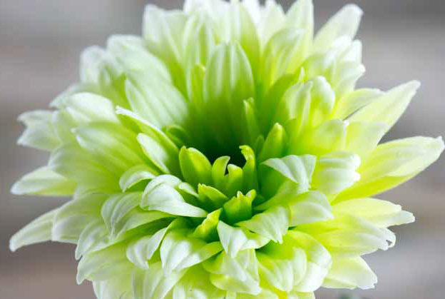
Here is an example:
<html><head></head><body><h2>Image Border</h2><div><img style="border: 10px inset black; margin-bottom=5px;" src="images/white-flower.jpg" alt="white-flower"><img style="border: 10px dashed red;" src="images/white-flower.jpg" alt="white-flower"></div></body></html>CSS Image Border Radius
The border-radius property in CSS is used to define the rounded corners of an element’s border, such as an image. By adjusting the border-radius value, you can control the degree of roundness for each corner of an element or make them fully circular.
The border-radius can have following values:
- length: Any length value, such as px, pt, em, etc.
- percentage (%): Any percentage value, such as 30%, 50%, 5%, etc.
- initial: Sets the initial value of border-radius value.
- inherit: Inherits the value of border-radius from parent element.
border-radius is a shorthand for:
- border-top-left-radius
- border-top-right-radius
- border-bottom-right-radius
- border-bottom-left-radius
Note: border-radius allows one, two, three or all four values in one declaration.
After adding a border radius the above image will look like this:

Here is an example:
<html><head><style>
   img {
      border: 2px solid black; margin-bottom: 5px; height: 200px;
   }
</style></head><body><h2>Image Border Radius</h2><div><img style="border-radius: 40px 60px;" src="images/white-flower.jpg" alt="white-flower"></div><div><img style="border-radius: 50%;" src="images/red-flower.jpg" alt="red-flower"></div><div><img style="border-top-left-radius: 50%;" src="images/pink-flower.jpg" alt="pink-flower"></div><div><img style="border-bottom-right-radius: 2em;" src="images/orange-flower.jpg" alt="orange-flower"></div></body></html>
CSS Image Opacity
The opacity property in CSS is used to adjust the transparency of an element. It allows you to control how transparent or opaque an image should be.
The opacity value can range from 0.0 (completely transparent) to 1.0 (completely opaque).
After adding opacity of different values the same image looks like this:
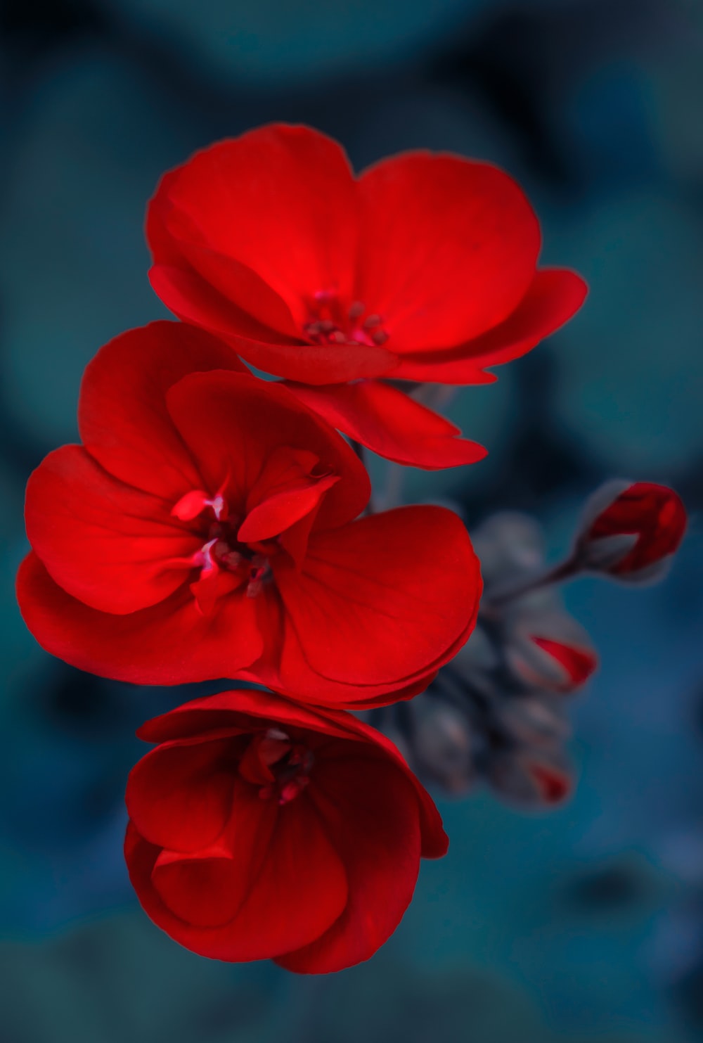

Here is an example:
<html><head><style>
   img {
      border: 2px solid black; margin-bottom: 5px; height: 200px;
   }
</style></head><body><h2>Image Opacity</h2><div><img style="opacity: 0.2;" src="images/red-flower.jpg" alt="opacity 0.2"></div><div><img style="opacity: 0.5;" src="images/red-flower.jpg" alt="opacity 0.5"></div><div><img style="opacity: 1;" src="images/red-flower.jpg" alt="opacity 1"></div></body></html>
CSS Image Object Fit
The object-fit property specifies how the image should be resized if its aspect ratio is not maintained. This property resizes an image to fit in its container.
This property can have one of the following values:
- contain: Aspect ratio is maintained. The content is proportionally scaled to fit within the container’s dimensions without cropping.
- cover: Content may be cropped to maintain the aspect ratio. The content is proportionally scaled to fill the container’s dimensions.
- fill: Stretches the content to fit the container’s dimensions, disregarding the aspect ratio.
- none: Content is displayed at its original size, without any scaling or cropping.
- scale-down: Content is displayed as if none or contain were specified. When the content is smaller than the container’s dimensions, it will be scaled down to fit proportionally. If it is larger, it will behave as contain.
Here is an example:
<html><head><style>
   img {
      border: 2px solid black; margin-bottom: 5px; height: 200px; width: 200px;
   }
</style></head><body><h2>Image Object-fit</h2><div><h3>fill</h3><img style="object-fit: fill;" src="images/white-flower.jpg" alt="object-fit: fill"></div><div><h3>cover</h3><img style="object-fit: cover;" src="images/white-flower.jpg" alt="object-fit: cover"></div><div><h3>contain</h3><img style="object-fit: contain;" src="images/white-flower.jpg" alt="object-fit: contain"></div><div><h3>none</h3><img style="object-fit: none;" src="images/white-flower.jpg" alt="object-fit: none"></div><div><h3>scale-down</h3><img style="object-fit: scale-down;" src="images/white-flower.jpg" alt="object-fit: scale-down"></div></body></html>
CSS Image Position
The property object-position is used to position the replaced element, such as an image, in its container.
The object-position property can have following values:
- <position>: Defines the 2D position of the element from one of these values – top, bottom, left, right, center.
- <length-percentage>: Any lenght or percentage value. Example :50px, 30%
- initial: Sets the initial value of object-position.
- inherit: Inherits the value of object-position from its parent element.
Here is an example:
<html><head><style>
   article {
      margin: 0.5rem;
      display: grid;
      grid-template-columns: repeat(auto-fit, minmax(30ch, 1fr));
      gap: 0.5rem;
   }
   .img-container {
      width: 20ch;
      border: 1ch solid #71a589;
      background: orange;
   }
   img {
      width: 100%;
      display: block;
      object-fit: none;
   }
   .image-1 {
      object-position: 50% 50%;
   }
   .image-2 {
      object-position: left bottom;
   }
   .image-3 {
      object-position: 20% 80%;
   }
   .image-4 {
      object-position: 40px 60px;
   }
   .image-5 {
      object-position: right 75%;
   }
   .image-6 {
      object-position: 10px center;
   }
</style></head><body><h2>Image Object Position</h2><article><div class="container"><h3>1. Default Value</h3><div class="img-container"><img class="image-1" src="images/scenery2.jpg" /></div></div><div class="container"><h3>2. object-position: left bottom;</h3><div class="img-container"><img class="image-2" src="images/scenery2.jpg" /></div></div><div class="container"><h3>3. object-position: 20% 80%;</h3><div class="img-container"><img class="image-3" src="images/scenery2.jpg" /></div></div><div class="container"><h3>4. object-position: 40px 60px;</h3><div class="img-container"><img class="image-4" src="images/scenery2.jpg" /></div></div><div class="container"><h3>5. object-position: right 75%;</h3><div class="img-container"><img class="image-5" src="images/scenery2.jpg" /></div></div><div class="container"><h3>6. object-position: 10px center;</h3><div class="img-container"><img class="image-6" src="images/scenery2.jpg" /></div></div></article></body></html>
CSS Image Filter
The filter property in CSS is used to apply visual effects to an element, such as blurring, inverting colors, adjusting brightness and contrast, or applying filters like grayscale.
The same effect can be achieved for an image.
The filter property accepts a variety of functions and values that specify the specific effect to be applied. Here are some commonly used functions:
- blur(<length>): Makes the image blur. Example = blur(5px)
- brightness(<number>|<percentage>): Adjusts the brightness of the image. Example = brightness(0.5|30%)
- contrast(<number>|<percentage>): Adjusts the contrast of the image. Example = contrast(50%)
- grayscale(<number>|<percentage>): Converts the image to a grayscale image. Example = grayscale(80%)
- hue-rotate(<angle>|<zero>): Hue rotation applied. Example = hue-rotate(80deg)
- drop-shadow(offsetx offsety blur-radius color): Adds a shadow effect to the image. Example = drop-shadow(3px 5px 10px red)
- opacity(<number>|<percentage>): Adjusts the transparency of the image. Example = opacity(0.4)
- invert(<number>|<percentage>): Inverts the colors of the element, making it appear with inverted color values. Example = invert(20%)
- saturate(<number>|<percentage>): Adjusts the saturation of the image. Example = saturate(0.8)
- sepia(<number>|<percentage>): Applies a sepia effect to the element, making it appear with a vintage brownish tone. Example = sepia(50%)
You can combine these functions in any number to adjust the rendering of an image. The order that you follow to pass the values, will be followed in image rendering.
Here is an example:
<html><head></head><body><h2>Filter Image</h2><div><h3>No Filter</h3><img style="object-fit: none;" src="images/scenery2.jpg" alt="No filter"></div><div><h3>Filter blur</h3><img style="object-fit: none; filter: blur(5px);" src="images/scenery2.jpg" alt="filter blur"></div><div><h3>Filter grayscale</h3><img style="object-fit: none; filter: grayscale(80%);" src="images/scenery2.jpg" alt="filter grayscale"></div><div><h3>Filter saturate</h3><img style="object-fit: none; filter: saturate(40%);" src="images/scenery2.jpg" alt="filter saturate"></div></body></html>CSS Image Shadow Effect
CSS provides a property box-shadow that helps in adding a shadow effect to an element, such as an image.
A box shadow is described by horizontal and vertical offsets relative to the element, blur and spread radius, and color. Following is the syntax of box-shadow:
{ box-shadow: inset horizontal vertical blur-radius spread color; }
The property can have following values:
- inset: It is an optional keyword that sets whether the shadow sits inside or outside of the element. If inset is not specified, the shadow will sit outside.
- horizontal: Required to set horizontal distance of the shadow from the box.
- vertical: Required to set vertical distance of the shadow from the box.
- blur radius: Optional. It is a length value. The larger this value, the bigger the blur, so the shadow becomes bigger and lighter. Negative values are not allowed. If not specified, it will be 0 (the shadow’s edge is sharp).
- spread: Optional. Sets the distance the shadow spreads. A positive length makes the shadow larger than its element, and a negative length makes it smaller. If not specified, it will be 0 (the shadow will be the same size as the element).
- color: Refer color values for possible keywords and notations. If not specified, it defaults to currentcolor.
Example = box-shadow(10px 10px 20px #3300FF)
After applying the shadow, an image will look like this:
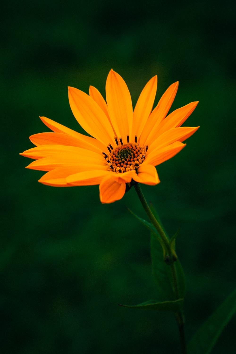
Here is an example:
<html><head><style>
   .img1{
      object-fit: none;
      box-shadow: none
   }
   .img2{
      object-fit: none;
      box-shadow: 40px 40px 10px rgb(247, 174, 187);
   }
   .img3{
      object-fit: none;
      box-shadow: -40px 40px 10px rgb(247, 174, 187);
   }
</style></head><body><h2>Image Shadow</h2><div><h3>Box shadow on image: None</h3><img class="img1" src="images/scenery2.jpg" alt="No filter"></div><div><h3>Box shadow on image</h3><img class="img2" src="images/scenery2.jpg" alt="No filter"></div><div><h3>Box shadow on image:negative value</h3><img class="img3" src="images/scenery2.jpg" alt="No filter"></div></body></html>
CSS Image As Background
CSS allows an image to be set as a background for another element. The property that can be used for this purpose is background-image.
The background-image property sets one or more than one image as a background.
It can have following values:
- none: Specifies no image to be set as background.
- <image>: URL of the image to be set as background.
Note: You can add multiple images as background. You just need to separate the images using comma.
Here is an example:
<html><head><style>
   body {
      background-color: beige;
      background-image: url(images/logo.png);
   }
</style></head><body></body></html>
CSS Image Properties – Summary
Following is the list of CSS properties for styling images:
| Sr.No. | Property & Description |
|---|---|
| 1 | heightSets the height of the image. |
| 2 | widthSets the width of the image. |
| 3 | borderSets the border of the image. |
| 4 | image effectsSets different effects to the image, such as blur, brightness, contrast, etc. |
| 5 | image-orientationDetermines the display or orientation of the image. |
| 6 | image-renderingControls how the image should be rendered by the browser. |
| 7 | background-imageDefines a pointer to an image resource which is to be placed in the background of an element. |
| 8 | border-imageThis property allows you to add an image as a border around an element. |
| 9 | opacityIt allows you to control how transparent or opaque an image should be. |
| 10 | object-fitSpecifies how the image should be resized if its aspect ratio is not maintained |
| 11 | object-positionIt is used to position the replaced element, such as an image, in its container. |
| 13 | box-shadowIt helps in adding a shadow effect to an element, such as an image. |
| 14 | border-radiusIt defines the rounded corners of an element’s border, such as an image. |
Leave a Reply