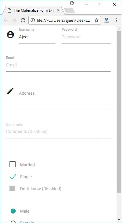
Forms are used as a standard way to receive user inputted data. Materialize CSS provides a very beautiful and responsive CSS for form designing. The transitions and smoothness of these elements are very important because of the inherent user interaction associated with forms.
| Index | Class name | Description |
|---|---|---|
| 1) | input-field | It is used to set the div container as an input field container. Required. |
| 2) | validate | It is used to add validation styles to an input field. |
| 3) | active | It is used to show an input with active style. |
| 4) | materialize-textarea | It is used to style a text-area. The text-areas will auto resize to the text inside. |
| 5) | filled-in | It show a checkbox with filled box style. |
Example
Let’s take an example to demonstrate the use of input classes to showcase a sample form.
<html>

   <head>

      <title>The Materialize Form Example</title>

      <meta name = "viewport" content = "width = device-width, initial-scale = 1">

      <link rel = "stylesheet"

         href = "https://fonts.googleapis.com/icon?family=Material+Icons">

      <link rel = "stylesheet"

         href = "https://cdnjs.cloudflare.com/ajax/libs/materialize/0.97.3/css/materialize.min.css">

      <script type = "text/javascript"

         src = "https://code.jquery.com/jquery-2.1.1.min.js"></script>

      <script src = "https://cdnjs.cloudflare.com/ajax/libs/materialize/0.97.3/js/materialize.min.js">

      </script>

   </head>


   <body class = "container">

      <div class = "row">

         <form class = "col s12">

            <div class = "row">

               <div class = "input-field col s6">

                  <i class = "material-icons prefix">account_circle</i>

                  <input placeholder = "Username" value = "Ajeet" id = "name"

                     type = "text" class = "active validate" required />

                  <label for = "name">Username</label>

               </div>


               <div class = "input-field col s6">

                  <label for = "password">Password</label>

                  <input id = "password" type = "password" placeholder = "Password"

                     class = "validate" required />

               </div>

            </div>


            <div class = "row">

               <div class = "input-field col s12">

                  <input placeholder = "Email" id = "email" type = "email"

                     class = "validate">

                  <label for = "email">Email</label>

               </div>

            </div>


            <div class = "row">

               <div class = "input-field col s12">

                  <i class = "material-icons prefix">mode_edit</i>

                  <textarea id = "address" class = "materialize-textarea"></textarea>

                  <label for = "address">Address</label>

               </div>

            </div>


            <div class = "row">

               <div class = "input-field col s12">

                  <input placeholder = "Comments (Disabled)" id = "comments"

                     type = "text" disabled />

                  <label for = "comments">Comments</label>

               </div>

            </div>


            <div class = "row">

               <div class = "input-field col s12">

                  <p>

                     <input id = "married" type = "checkbox" class = "filled-in" />

                     <label for = "married">Married</label>

                  </p>


                  <p>

                     <input id = "single" type = "checkbox" checked = "checked" />

                     <label for = "single">Single</label>

                  </p>


                  <p>

                     <input id = "dontknow" type = "checkbox" disabled = "disabled" />

                     <label for = "dontknow">Don't know (Disabled)</label>

                  </p>

               </div>

            </div>


            <div class = "row">

               <div class = "input-field col s12">

                   <p>

                     <input id = "male" type = "radio" name = "gender"

                        value = "male" checked />

                     <label for = "male">Male</label>

                  </p>


                  <p>

                     <input id = "female" type = "radio" name = "gender"

                        value = "female"  />

                     <label for = "female">Female</label>

                  </p>


                  <p>

                     <input id = "dontknow1" type = "radio" name = "gender"

                        value = "female" disabled />

                     <label for = "dontknow1">Don't know (Disabled)</label>

                  </p>

               </div>

            </div>

         </form>

      </div>

   </body>

</html>
Output:

List of Input Control
Materialize CSS offers several types of input controls. Following is a list:
| Index | Input types | Description |
|---|---|---|
| 1) | select | It specifies various types of selects inputs |
| 2) | switches | It specifies various types of switches |
| 3) | file | It specifies various types of file inputs |
| 4) | range | It specifies various types of range inputs |
| 4) | date picker | It specifies date picker |
| 5) | character counter | It specifies character counter |
Leave a Reply