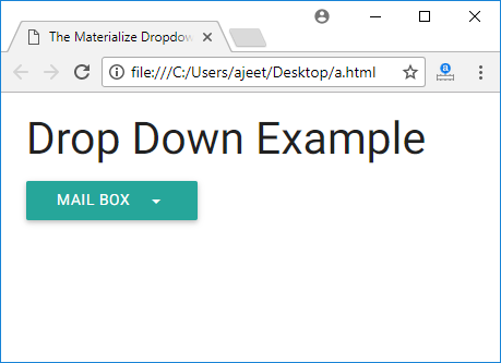
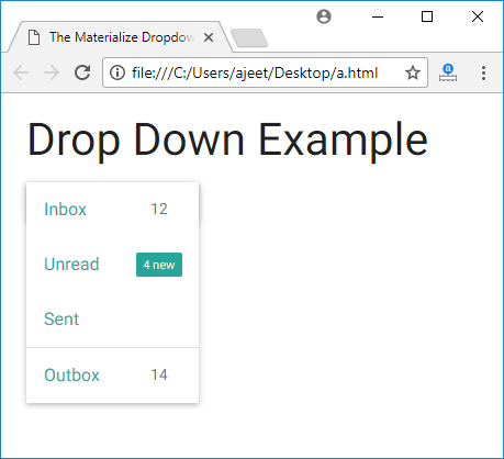
Materialize CSS provides dropdown facility. It provides several CSS classes to make ul element as a dropdown and add the id of the ul element to the data-activates attribute of the button or anchor element.
Following is the list of classes and their effects:
| Index | Class name | Description |
|---|---|---|
| 1) | dropdown-content | It is used to identify ul as a materialize dropdown component. It is required for ul element. |
| 2) | data-activates | It is used to specify id of the dropdown ul element. |
How to use Dropdown?
To add a dropdown list to any button, you must ensure that the data-activates attribute matches the id in the <ul> tag. You can add a divider with the <li class=”divider”></li> tag. You can also add icons. Just add the icon inside the anchor tag.
Example
Let’s take an example to demonstrate dropdown:
<!DOCTYPE html>

<html>

   <head>

      <title>The Materialize Dropdowns Example</title>

      <meta name = "viewport" content = "width = device-width, initial-scale = 1">

      <link rel = "stylesheet"

         href = "https://fonts.googleapis.com/icon?family=Material+Icons">

      <link rel = "stylesheet"

         href = "https://cdnjs.cloudflare.com/ajax/libs/materialize/0.97.3/css/materialize.min.css">

      <script type = "text/javascript"

         src = "https://code.jquery.com/jquery-2.1.1.min.js"></script>

      <script src = "https://cdnjs.cloudflare.com/ajax/libs/materialize/0.97.3/js/materialize.min.js">

      </script>

   </head>


   <body class = "container">

      <h3>Drop Down Example</h3>

      <ul id = "dropdown" class = "dropdown-content">

         <li><a href = "#">Inbox<span class = "badge">12</span></a></li>

         <li><a href = "#!">Unread<span class = "new badge">4</span></a></li>

         <li><a href = "#">Sent</a></li>

         <li class = "divider"></li>

         <li><a href = "#">Outbox<span class = "badge">14</span></a></li>

      </ul>


      <a class = "btn dropdown-button" href = "#" data-activates = "dropdown">Mail Box

         <i class = "mdi-navigation-arrow-drop-down right"></i></a>

   </body>

</html>
Output:


Leave a Reply