CSS Grid Layout is a two-dimensional layout system for the web that allows you to create complex grid-based layouts with rows and columns. It is a part of the Cascading Style Sheets (CSS) standard, specifically designed for building user interfaces and web page layouts. CSS Grid Layout provides a more sophisticated and powerful way to structure and position elements on a web page compared to traditional methods.
Grid layout offers various features like grid lines, grid gaps, named grid areas, and more, making it a versatile tool for creating sophisticated and responsive layouts on the web. We will study all these in the following sections.
Defining CSS Grid Layout
Here is a simple example of how you can define a grid layout in CSS:
.container {
   display: grid;
   grid-template-columns: 100px 200px 100px;
   grid-template-rows: 50px 100px;
}

.item {
   border: 1px solid black;
   padding: 10px;
}

/* Example usage of grid areas */
.item1 {
   grid-column: 1 / 3;
   grid-row: 1 / 2;
}

.item2 {
   grid-column: 2 / 4;
   grid-row: 2 / 3;
}
In this example:
- The .container element is set to display: grid, indicating that it will use grid layout.
- grid-template-columns and grid-template-rows define the size and number of columns and rows in the grid.
- The .item elements represent the items you want to place within the grid.
- The grid-column and grid-row properties are used to specify the placement of items within the grid.
Grid Container
You can create a grid container by declaring display: grid or display: inline-grid on an element.
The following example demonstrates that how to create grid container using display: grid property −
<html><head><style>
   .grid-container {
      display: grid;
      border: 3px solid red;
      background-color: white;
   }
   .grid-container > div {
      border: 2px solid blue;
      border-radius: 5px;
      background-color: violet;
      padding: 10px;
   }
</style></head><body><div class="grid-container"><div>Grid Item 1</div><div>Grid Item 2</div><div>Grid Item 3</div><div>Grid Item 4</div><div>Grid Item 5</div></div></body></html>
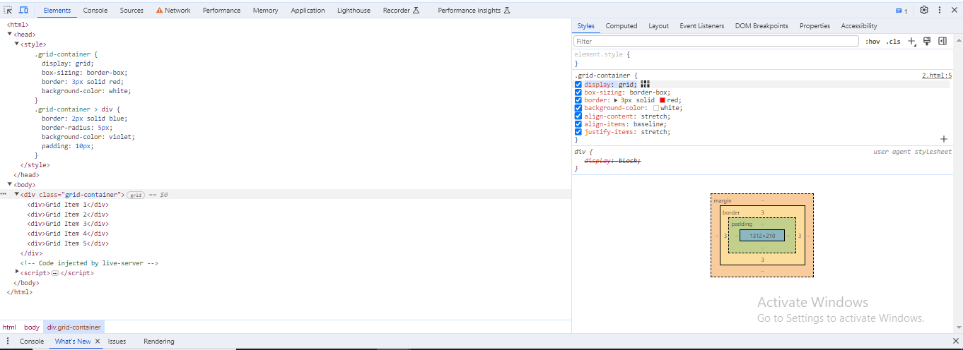
Each direct children are converted into grid items and appears visually the same as before. By default, the grid generates a single-column layout. When you explore the grid in Firefox, you will notice a little icon next to the value grid. By clicking the grid icon, the grid for this element will be overlaid in the browser window.
The following diagram demonstrates the icon next to the value grid:

Grid Tracks
Grid tracks are defined by grid-template-rows and grid-template-columns, which indicate the spaces between adjacent lines on the grid.
The following diagram highlights the first-row track in the grid layout:

Grid tracks can be created :
- in the explicit grid by using the grid-template-columns and grid-template-rows, as well as shorthand grid or grid-template properties.
- in the implicit grid by positioning a grid item outside of the tracks created in the explicit grid.
CSS Grid Layout – Grid Tracks Using grid-template-columns
The following example demonstrates the property grid-template-columns: 250px 250px 250px creates a grid layout with three columns, each having a width of 250px −
<html><head><style>
   .grid-container {
      display: grid;
      grid-template-columns: 250px 250px 250px;
      background-color: lightcyan;
      border: 2px solid red;
      padding: 5px;
   }
   .grid-container > div {
      background-color: violet;
      border: 2px solid red;
      padding: 10px;
   }
</style></head><body><div class="grid-container"><div>Grid Item 1</div><div>Grid Item 2</div><div>Grid Item 3</div><div>Grid Item 4</div><div>Grid Item 5</div><div>Grid Item 6</div></div></body></html>
CSS Grid Layout – Grid Tracks With The fr Unit
Grid allows you to define tracks in a variety of length units, including the new “fr” unit, which represents a fraction of the available space in the grid container.
The following example demonstrates the property grid-template-columns: 1fr 1fr 1fr; creates a grid layout with three columns, each having a width of 1fr −
<html><head><style>
   .grid-container {
      display: grid;
      grid-template-columns: 1fr 1fr 1fr;
      background-color: lightcyan;
      border: 2px solid red;
      padding: 5px;
   }
   .grid-container > div {
      background-color: violet;
      border: 2px solid red;
      padding: 10px;
   }
</style></head><body><div class="grid-container"><div>Grid Item 1</div><div>Grid Item 2</div><div>Grid Item 3</div><div>Grid Item 4</div><div>Grid Item 5</div><div>Grid Item 6</div></div></body></html>
CSS Grid Layout – Grid Tracks Unequal Sizes
The following example demonstrates the property grid-template-columns: 1fr 2fr 1fr; creates a grid layout with three unequal columns, the first and third columns take up equal space (1fr), while the second column takes up double the space (2fr) −
<html><head><style>
   .grid-container {
      display: grid;
      grid-template-columns: 1fr 2fr 1fr;
      background-color: lightcyan;
      border: 2px solid red;
      padding: 5px;
   }
   .grid-container > div {
      background-color: violet;
      border: 2px solid red;
      padding: 10px;
   }
</style></head><body><div class="grid-container"><div>Grid Item 1</div><div>Grid Item 2</div><div>Grid Item 3</div><div>Grid Item 4</div><div>Grid Item 5</div><div>Grid Item 6</div></div></body></html>
CSS Grid Layout – Grid Tracks With Flexible And Absolute Sizes
The following example demonstrates the property grid-template-columns: 1fr 2fr 100px; creates a grid layout with three unequal columns, the first column takes 1fr of the available space, the second column takes 2fr, and the third column has a fixed width of 100px −
<html><head><style>
   .grid-container {
      display: grid;
      grid-template-columns: 1fr 2fr 100px;
      background-color: lightcyan;
      border: 2px solid red;
      padding: 5px;
   }
   .grid-container > div {
      background-color: violet;
      border: 2px solid red;
      padding: 10px;
   }
</style></head><body><div class="grid-container"><div>Grid Item 1</div><div>Grid Item 2</div><div>Grid Item 3</div><div>Grid Item 4</div><div>Grid Item 5</div><div>Grid Item 6</div></div></body></html>
CSS Grid Layout – Grid Tracks With repeat()
The repeat() notation is useful for large grids with many tracks, to define a pattern of repeated track sizes within a grid.
The below code defines three columns, each with a size of 250px.
.grid-container {
   display: grid;
   grid-template-columns: 250px 250px 250px;
}
The above code can alternatively be written as:
.grid-container {
   display: grid;
   grid-template-columns: repeat(3, 250px);
}
The following example demonstrates the property grid-template-columns: repeat(3, 250px) creates a grid layout with three columns, each having a width of 250px −
<html><head><style>
   .grid-container {
      display: grid;
      grid-template-columns: repeat(3, 250px);
      background-color: lightcyan;
      border: 2px solid red;
      padding: 5px;
   }
   .grid-container > div {
      background-color: violet;
      border: 2px solid red;
      padding: 10px;
   }
</style></head><body><div class="grid-container"><div>Grid Item 1</div><div>Grid Item 2</div><div>Grid Item 3</div><div>Grid Item 4</div><div>Grid Item 5</div><div>Grid Item 6</div></div></body></html>
The repeat notation in Grid Layout allows you to create a repetitive pattern for a part of the track listing.
The following example demonstrates the grid-template-columns: 60px repeat(4, 1fr) 60px; property create a grid layout with six columns, the first column has a fixed width of 60px, the next four columns with a width of 1fr of the available space, and the last column is 20px wide −
<html><head><style>
   .grid-container {
      display: grid;
      grid-template-columns: 60px repeat(4, 1fr) 60px;
      background-color: lightcyan;
      border: 2px solid red;
      padding: 5px;
   }
   .grid-container > div {
      background-color: violet;
      border: 2px solid red;
      padding: 10px;
   }
</style></head><body><div class="grid-container"><div>Grid Item 1</div><div>Grid Item 2</div><div>Grid Item 3</div><div>Grid Item 4</div><div>Grid Item 5</div><div>Grid Item 6</div></div></body></html>
The following example demonstrates the grid-template-columns: repeat(3, 100px 150px); property creates three pairs of column widths, where each pair consists of a column of 100pxs followed by a column of 150px −
<html><head><style>
   .grid-container {
      display: grid;
      grid-template-columns: repeat(3, 100px 150px);
      background-color: lightcyan;
      border: 2px solid red;
      padding: 5px;
   }
   .grid-container > div {
      background-color: violet;
      border: 2px solid red;
      padding: 10px;
   }
</style></head><body><div class="grid-container"><div>Grid Item 1</div><div>Grid Item 2</div><div>Grid Item 3</div><div>Grid Item 4</div><div>Grid Item 5</div><div>Grid Item 6</div><div>Grid Item 7</div><div>Grid Item 8</div><div>Grid Item 9</div><div>Grid Item 10</div></div></body></html>
CSS Grid Layout – Implicit and Explicit Grids
The following example demonstrates the grid layout with explicit column sizes and automatically adjusts row spacing for an implicit grid −
- The grid-template-columns property creates three columns, each with a width of 1fr of the available area.
- The grid-auto-rows property sets a height of 100px for implicit rows.
<html><head><style>
   .grid-container {
      display: grid;
      grid-template-columns: repeat(3, 1fr);
      grid-auto-rows: 100px;
      background-color: lightcyan;
      border: 2px solid red;
      padding: 5px;
   }
   .grid-container > div {
      background-color: violet;
      border: 2px solid red;
      padding: 10px;
   }
</style></head><body><div class="grid-container"><div>Grid Item 1</div><div>Grid Item 2</div><div>Grid Item 3</div><div>Grid Item 4</div><div>Grid Item 5</div></div></body></html>
CSS Grid Layout – Track Sizing and Minmax
To ensure that tracks dynamically expand to adjust any additional content, you must provide a minimum size for each track whether creating an explicit grid or defining automatic sizing.
The following example demonstrates the grid layout with explicit column sizes and row sizing using minmax based on content.
The grid-template-rows: minmax(50px, auto); property automatically creats rows with minimum height of 50px, and a maximum of auto.
<html><head><style>
   .grid-container {
      display: grid;
      grid-template-columns: repeat(3, 1fr);
      grid-auto-rows: minmax(50px, auto);
      background-color: lightcyan;
      border: 2px solid red;
      padding: 5px;
   }
   .grid-container > div {
      background-color: violet;
      border: 2px solid red;
      padding: 10px;
   }
</style></head><body><div class="grid-container"><div>Grid Item 1</div><div>Grid Item 2
         <p>This cell has some additional content. The height of this row is increases above 50px.</p></div><div>Grid Item 3</div><div>Grid Item 4</div><div>Grid Item 5</div></div></body></html>
Grid Lines
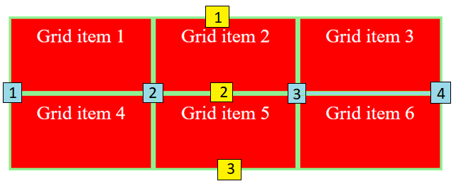
When you define a grid, you can provide tracks, not lines, and the grid system assigns numbered lines to place items, for example, four column lines in a three-column, two-row grid.
The following diagram demonstrates the grid lines for reference:

Line numbering in a grid is determined by writing mode: left-to-right languages have line 1 on the left, whereas right-to-left languages have it on the right.
CSS Grid Layout – Positioning Items Against Lines
The following example demonstrates the grid layout with three columns and three rows, each column having an equal width of 1fr and a row with a fixed height of 50px.
- The first grid item spans from row one to row three and from column one to column three.
- The second gird item starts from the second column and spans from the third to the fifth row.
<html><head><style>
   .grid-container {
      display: grid;
      grid-template-columns: repeat(3, 1fr);
      grid-auto-rows: 50px;
      background-color: lightgreen;
   }
   .grid-container > div {
      border: 2px solid lightgreen;
      background-color: red;
      padding: 5px;
      color: white;
   }
   .item1 {
      grid-column-start: 1;
      grid-column-end: 3;
      grid-row-start: 1;
      grid-row-end: 3;
   }
   .item2 {
      grid-column-start: 2;
      grid-row-start: 3;
      grid-row-end: 5;
   }
</style></head><body><div class="grid-container"><div class="item1">Grid Item 1</div><div class="item2">Grid Item 2</div><div>Grid Item 3</div><div>Grid Item 4</div><div>Grid Item 5</div></div></body></html>
Remember to use the Grid Inspector in Firefox Developer Tools to view how items align with the grid lines.
CSS Grid Layout – Line-positioning Shorthands
Line positioning in grid layouts can be more simplified using shorthand with grid-column and grid-row, where values before and after the forward slash (/) denote the start and end lines.
You can skip the end value if the area spans only one track.
.grid-container {
   display: grid;
   grid-template-columns: repeat(3, 1fr);
   grid-auto-rows: 50px;
}
.item1 {
   grid-column: 1 /3;
   grid-row: 1 / 4;
}
.item2 {
   grid-column: 2;
   grid-row: 2 / 5;
}
Grid Cells
A grid cell is the smallest unit on a grid.
The following diagram demonstrates the second cell of the grid.

Grid Areas
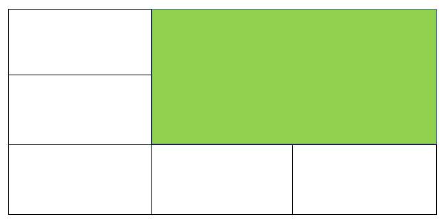
A grid area is created when items span one or more cells by row or column. Grid areas must have a rectangular shape. An L-shaped area cannot be created.
The following diagram demonstrates the grid area, which spans two columns and two rows.

Gutters
CSS properties grid-column, grid-row, and shorthand gaps can be used to create gutters or alleys between grid cells.
column-gap, row-gap, and gap were prefixed with the grid-prefix when the grid was initially used in browsers, becoming grid-column-gap, grid-row-gap, and grid-gap, respectively.
All browsers now support unprefixed values, with prefixed versions kept as aliases for compatibility and safety.
The following example demonstrates that the grid layout with 10px gap between the columns and 20px gap between the rows −
<html><head><style>
   .grid-container {
      display: grid;
      grid-template-columns: repeat(3, 1fr);
      column-gap: 10px;
      row-gap: 20px;
      column-gap: 10px;
      row-gap: 1em;
      border-radius: 5px;
      background-color: lightgreen;
   }
   .grid-container > div {
      border: 2px solid lightgreen;
      background-color: red;
      padding: 1em;
      color: white;
   }
</style></head><body><div class="grid-container"><div>Grid Item 1</div><div>Grid Item 2</div><div>Grid Item 3</div><div>Grid Item 4</div><div>Grid Item 5</div></div></body></html>
Nesting Grids
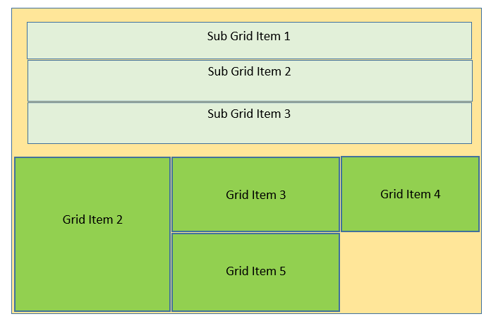
Nesting grids indicate the placing of grid containers inside other grid items.
The following diagram demonstrates the three-column grid layout with two positioned items .The first grid item contains sub-items. Since these sub-items are not direct children of the grid, they do not participate in the grid layout and appear in the normal document flow.

CSS Grid Layout – Nesting Without Subgrid
When you apply display: grid to item1 and provide a track definition, it acts as a nested grid container and the items align based on this new grid structure.
Here is an example −
<html><head><style>
   .grid-container {
      gap: 3px;
      background-color: lightgreen;
      display: grid;
      grid-template-columns: repeat(3, 1fr);
      padding: 5px;
   }
   .grid-item {
      background-color: red;
      padding: 10px;
      color: white;
   }
   .item1 {
      display: grid;
      grid-template-columns: repeat(3, 1fr);
      grid-column-start: 1;
      grid-column-end: 4;
      grid-row-start: 1;
      grid-row-end: 3;
      grid-column: 1 / 4;
   }
   .nested-item {
      border: 2px solid red;
      background-color: violet;
      padding: 10px;
   }
</style></head><body><div class="grid-container"><div class="grid-item item1"><div class="nested-item">Sub Grid item 1</div><div class="nested-item">Sub Grid item 2</div><div class="nested-item">Sub Grid item 3</div></div><div class="grid-item">Grid Item 2</div><div class="grid-item">Grid Item 3</div><div class="grid-item">Grid Item 4</div><div class="grid-item">Grid Item 5</div></div></body></html>
CSS Grid Layout -Subgrid
Subgrid allows the creation of nested grids that keep the track definition from the parent grid.
To implement subgrid, you can modify the nested grid example by changing grid-template-columns: repeat(3, 1fr) to grid-template-columns: subgrid, allowing it to keep the track definition from the parent grid for item layout.
.item1 {
   grid-column-start: 1;
   grid-column-end: 4;
   grid-row-start: 1;
   grid-row-end: 3;
   display: grid;
   grid-template-columns: subgrid;
}
Layering Items With z-index
When grid items are in the same cell, the stacking order of overlapping items can be controlled using the z-index property.
CSS Grid Layout – Overlapping Without z-index
The following example demonstrates how the grid item 2 overlaps the grid item 1 −
<html><head><style>
   .grid-container {
      display: grid;
      grid-template-columns: repeat(3, 1fr);
      grid-auto-rows: 50px;
      background-color: lightgreen;
   }
   .grid-item {
      border: 2px solid lightgreen;
      background-color: red;
      padding: 10px;
      color: white;
   }
   .item1 {
      grid-column-start: 1;
      grid-column-end: 4;
      grid-row-start: 1;
      grid-row-end: 3;
   }
   .item2 {
      grid-column-start: 1;
      grid-row-start: 2;
      grid-row-end: 4;
   }
</style></head><body><div class="grid-container"><div class="grid-item item1">Grid Item 1</div><div class="grid-item item2">Grid Item 2</div><div class="grid-item">Grid Item 3</div><div class="grid-item">Grid Item 4</div><div class="grid-item">Grid Item 5</div></div></body></html>
CSS Grid Layout – Controlling The Order
The following example demonstrates when grid item 2 has a lower z-index than grid item 1, it will appear in the stack below box1 −
<html><head><style>
   .grid-container {
      display: grid;
      grid-template-columns: repeat(3, 1fr);
      grid-auto-rows: 50px;
      background-color: lightgreen;
   }
   .grid-item {
      border: 2px solid lightgreen;
      background-color: red;
      padding: 10px;;
      color: white;
   }
   .item1 {
      grid-column-start: 1;
      grid-column-end: 4;
      grid-row-start: 1;
      grid-row-end: 3;
      z-index: 2;
   }
   .item2 {
      grid-column-start: 1;
      grid-row-start: 2;
      grid-row-end: 4;
      z-index: 1;
   }
</style></head><body><div class="grid-container"><div class="grid-item item1">Grid Item 1</div><div class="grid-item item2">Grid Item 2</div><div class="grid-item">Grid Item 3</div><div class="grid-item">Grid Item 4</div><div class="grid-item">Grid Item 5</div></div></body></html>
Leave a Reply