CSS flexbox is a layout model in CSS that provides an efficient and flexible way to arrange and distribute space between items within a container. It arranges elements in a single dimension, either horizontally or vertically, within a container.
Flexbox organizes elements within a container along a single dimension, which can be either horizontally or vertically aligned.
This chapter will cover all the properties for managing the positioning, alignment, and gaps between elements along both the main and cross axes.
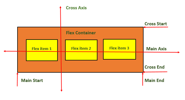
The following diagram demonstrates the flexbox layout for reference:

CSS Flexbox Layout
Create flexbox layout by defining a parent container with the class flexbox-container.
Let us see an example −
<html><head><style>
   .flex-container {
      display: flex;
      background-color: green;
   }
   .flex-container>div {
      background-color: yellow;
      margin: 10px;
      padding: 15px;
   }
</style></head><body><div class="flex-container"><div>Flex item 1</div><div>Flex item 2</div><div>Flex item 3</div><div>Flex item 4</div></div></body></html>
CSS Display – Flex
Flexbox layout uses display: flex property for aligning and distributing elements within a layout container.
Let us see an example −
<html><head><style>
   .flex-container {
      display: flex;
      background-color: green;
   }
   .flex-container>div {
      background-color: yellow;
      margin: 10px;
      padding: 15px;
   }
</style></head><body><div class="flex-container"><div>Flex item 1</div><div>Flex item 2</div><div>Flex item 3</div></div></body></html>
CSS Display – Inline-flex
Flexbox layout can also use display: inline-flex property to create an inline-level flex container, allowing elements to be aligned and distributed within it.
Let us see an example −
<html><head><style>
   .flex-container {
      display: inline-flex;
      background-color: green;
   }
   .flex-container>div {
      background-color: yellow;
      margin: 10px;
      padding: 15px;
   }
</style></head><body><div class="flex-container"><div>Flex item 1</div><div>Flex item 2</div><div>Flex item 3</div></div></body></html>
CSS Flexbox Container – Related Properties
Some of the properties of the flex container are listed as follows −
| property | value |
|---|---|
| flex-direction | Sets the flex direction of the flex items. |
| flex-wrap | Sets whether flex items should wrap onto the next line |
| justify-content | Sets the alignment of flex items along the main axis. |
| align-items | Sets the alignment of flex items along the cross axis. |
| align-content | Sets the alignment and spacing of flex lines within the flex container. |
| flex-flow | Sets both the flex-direction and flex-wrap properties. |
CSS Flexbox Items – Related Properties
Some of the properties of the flex items are as follows −
| property | value |
|---|---|
| flex-grow | Sets flex item to grow within a flex container. |
| flex-shrink | Sets flex item to shrink in size to fit the available space. |
| flex-basis | Sets the initial size of a flex item. |
| flex | Shorthand property, combines three flex-related properties: flex-grow, flex-shrink, and flex-basis. |
| align-self | Sets the alignment of a specific flex item along the cross-axis. |
Leave a Reply