P-V-T behavior can be generalized in terms of Tc, Pc, and ω. The original correlation was presented by Pitzer, and is given in the form

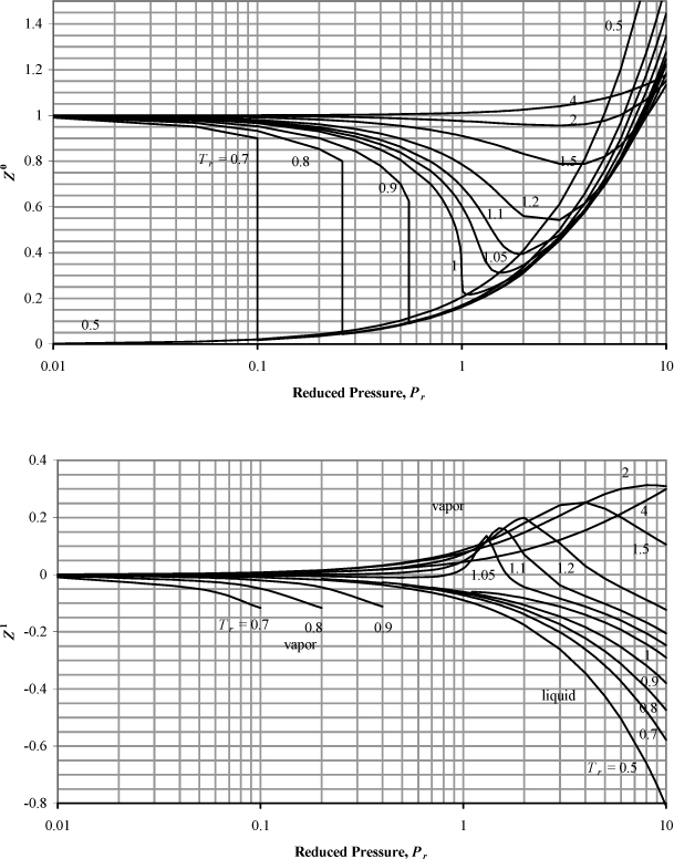
where tables or charts summarized the values of Z0 and Z1 at reduced temperature and pressure. The broad availability of computers and programmable calculators is making this approach somewhat obsolete, but it is worthwhile to visualize the trends. Fig. 7.44 may be applied for most hydrocarbons. The plot of Z0 represents the behavior of a fluid that would have an acentric factor of 0, and the plot of Z1 represents the quantity ![]() , which is the correction factor for a hypothetical fluid with an acentric factor of 1. By perusing the table on the back flap of this book, you will notice that most fluids fall between these ranges so that the charts may be used for interpolation.
, which is the correction factor for a hypothetical fluid with an acentric factor of 1. By perusing the table on the back flap of this book, you will notice that most fluids fall between these ranges so that the charts may be used for interpolation.

Figure 7.4. Generalized charts for estimating the compressibility factor. (Z0) applies the Lee-Kesler equation using ω = 0.0, and (Z1) is the correction factor for a hypothetical compound with ω = 1.0. Note the semilog scale.
Eqn. 7.3 can be applied to any fluid once Tr, Pr, and ω are known. It should be noted, however, that this graphical approach is rarely used in current practice since computer programs are more conveniently written in terms of the equations of state as demonstrated in Section 7.5 and the homework.
Example 7.1. Application of the generalized charts
Estimate the specific volume in cm3/g for carbon dioxide at 310 K and (a) 8 bar (b) 75 bar by the compressibility factor charts and compare to the experimental values2 of 70.58 and 3.90, respectively.
Solution
ω = 0.228 and Tr = 310/304.2 = 1.02 for both cases (a) and (b), so,
a. Pr = 8/73.82 = 0.108; from the charts, Z0 = 0.96 and Z1 = 0, so Z = 0.96.
V = ZRT/(P·MW) = (0.96·83.14·310)/(8·44) = 70.29, within 0.4% of the experimental value.
b. Pr = 75/73.82 = 1.016 ≈ 1.02; Note that the compressibility factor is extremely sensitive to temperature in the critical region. To obtain a reasonable degree of accuracy in reading the charts, we must interpolate between the reduced temperatures of 1.0 and 1.05 which we can read with more confidence.
At Tr = 1.0, Z0 = 0.22 and Z1 = –0.08 so Z = 0.22 + 0.228·(–0.08) = 0.202
At Tr = 1.05, Z0 = 0.58 and Z1 = 0.03, so Z = 0.58 + 0.228·(0.03) = 0.587
Interpolating, Z = 0.202 + (0.587 – 0.202)·2/5 = 0.356
V = ZRT/(P·MW) = (0.356·8.314·310)/(7.5·44) = 2.78, giving 29% error relative to the experimental value.
It should be noted that the relative error encountered in this example is somewhat exaggerated relative to most conditions because the Z-charts are highly non-linear in the critical region used in this problem. Since the compressibility factor charts essentially provide a “linear interpolation” between Z values for ω = 0 and ω = 1, the error is large in the critical region. If the reduced temperature had been slightly higher, (e.g., Tr = 1.1), then the relative error would have been roughly 1%, as demonstrated in the homework problems. It would be a simple matter to specify conditions that would make the chart look much more reliable, but then students might tend to err liberally rather than conservatively. For better reliability, computer methods provide proper alternatives, and these are easily applied on any modern engineering calculator. Example 7.5 on page 268 will demonstrate in detail the validity of this perspective.
Leave a Reply