2D Transformation of Elements
With CSS3 2D transform feature you can perform basic transform manipulations such as move, rotate, scale and skew on elements in a two-dimensional space.
A transformed element doesn’t affect the surrounding elements, but can overlap them, just like the absolutely positioned elements. However, the transformed element still takes space in the layout at its default (un-transformed) location.
Using CSS Transform and Transform Functions
The CSS3 transform property uses the transform functions to manipulate the coordinate system used by an element in order to apply the transformation effect.
The following section describes these transform functions:
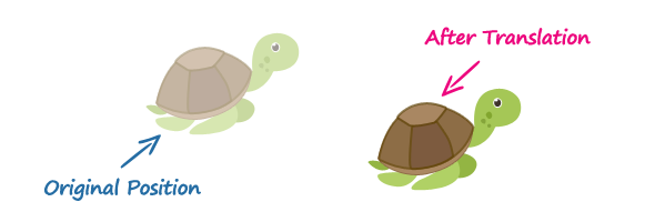
The translate() Function
Moves the element from its current position to a new position along the X and Y axes. This can be written as translate(tx, ty). If ty isn’t specified, its value is assumed to be zero.
Example
img {
    -webkit-transform: translate(200px, 50px);  /* Chrome, Safari, Opera */
       -moz-transform: translate(200px, 50px);  /* Firefox */
        -ms-transform: translate(200px, 50px);  /* IE 9 */
            transform: translate(200px, 50px);  /* Standard syntax */
}
The function translate(200px, 50px) moves the image 200 pixels horizontally along the positive x-axis, and 50 pixels vertically along the positive y-axis.

The rotate() Function
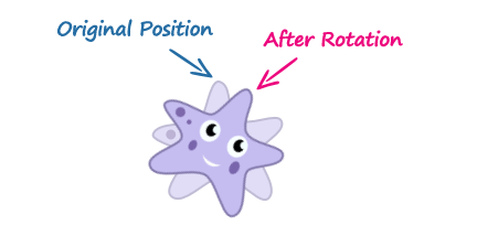
The rotate() function rotates the element around its origin (as specified by the transform-origin property) by the specified angle. This can be written as rotate(a).
Example
img {
    -webkit-transform: rotate(30deg);  /* Chrome, Safari, Opera */
       -moz-transform: rotate(30deg);  /* Firefox */
        -ms-transform: rotate(30deg);  /* IE 9 */
            transform: rotate(30deg);  /* Standard syntax */
}
The function rotate(30deg) rotates the image in clockwise direction about its origin by the angle 30 degrees. You can use negative values to rotate the element counter-clockwise.

The scale() Function
The scale() function increases or decreases the size of the element. It can be written as scale(sx, sy). If sy isn’t specified, it is assumed to be equal to sx.
Example
img {
    -webkit-transform: scale(1.5);  /* Chrome, Safari, Opera */
       -moz-transform: scale(1.5);  /* Firefox */
        -ms-transform: scale(1.5);  /* IE 9 */
            transform: scale(1.5);  /* Modern Browsers */
}
The function scale(1.5) proportionally scale the width and height of the image 1.5 times to its original size. The function scale(1) or scale(1, 1) has no effect on the element.

The skew() Function
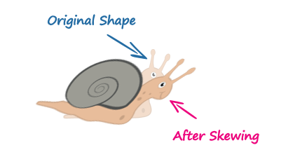
The skew() function skews the element along the X and Y axes by the specified angles. It can be written as skew(ax, ay). If ay isn’t specified, its value is assumed to be zero.
Example
img {
    -webkit-transform: skew(-40deg, 15deg);  /* Chrome, Safari, Opera */
       -moz-transform: skew(-40deg, 15deg);  /* Firefox */
        -ms-transform: skew(-40deg, 15deg);  /* IE 9 */
            transform: skew(-40deg, 15deg);  /* Modern Browsers */
}
The function skew(-40deg, 15deg) skews the element -40 degree horizontally along the
x-axis, and 15 degree vertically along the y-axis.

The matrix() Function
The matrix() function can perform all of the 2D transformations such as translate, rotate, scale, and skew at once. It takes six parameters in the form of a matrix which can be written as matrix(a, b, c, d, e, f). The following section will show you how each of the 2D transformation functions can be represented using the matrix().
translate(tx, ty) = matrix(1, 0, 0, 1, tx, ty);— wheretxandtyare the horizontal and vertical translation values.rotate(a) = matrix(cos(a), sin(a), -sin(a), cos(a), 0, 0);— where a is the value in deg. You can swap thesin(a)and-sin(a)values to reverse the rotation. The maximum rotation you could perform is 360 degrees.scale(sx, sy) = matrix(sx, 0, 0, sy, 0 ,0);— wheresxandsyare the horizontal and vertical scaling values.skew(ax, ay) = matrix(1, tan(ay), tan(ay), 1, 0 ,0);— whereaxandayare the horizontal and vertical values in deg.
Here is an example of performing the 2D transformation using the matrix() function.
Example
img {
    -webkit-transform: matrix(0, -1, 1, 0, 200px, 50px);  /* Chrome, Safari, Opera */
       -moz-transform: matrix(0, -1, 1, 0, 200px, 50px);  /* Firefox */
        -ms-transform: matrix(0, -1, 1, 0, 200px, 50px);  /* IE 9 */
            transform: matrix(0, -1, 1, 0, 200px, 50px);  /* Standard syntax */
}
However, when performing more than one transformation at once, it is more convenient to use the individual transformation function and list them in order, like this:
Example
img {
    -webkit-transform: translate(200px, 50px) rotate(180deg) scale(1.5) skew(0, 30deg);  /* Chrome, Safari, Opera */
       -moz-transform: translate(200px, 50px) rotate(180deg) scale(1.5) skew(0, 30deg);  /* Firefox */
        -ms-transform: translate(200px, 50px) rotate(180deg) scale(1.5) skew(0, 30deg);  /* IE 9 */
            transform: translate(200px, 50px) rotate(180deg) scale(1.5) skew(0, 30deg);  /* Standard syntax */
}
2D Transform Functions
The following table provides a brief overview of all the 2D transformation functions.
| Function | Description |
|---|---|
translate(tx,ty) | Moves the element by the given amount along the X and Y-axis. |
translateX(tx) | Moves the the element by the given amount along the X-axis. |
translateY(ty) | Moves the the element by the given amount along the Y-axis. |
rotate(a) | Rotates the element by the specified angle around the origin of the element, as defined by the transform-origin property. |
scale(sx,sy) | Scale the width and height of the element up or down by the given amount. The function scale(1,1) has no effect. |
scaleX(sx) | Scale the width of the element up or down by the given amount. |
scaleY(sy) | Scale the height of the element up or down by the given amount. |
skew(ax,ay) | Skews the element by the given angle along the X and Y-axis. |
skewX(ax) | Skews the element by the given angle along the X-axis. |
skewY(ay) | Skews the element by the given angle along the Y-axis. |
matrix(n,n,n,n,n,n) | Specifies a 2D transformation in the form of a transformation matrix comprised of the six values. |
Leave a Reply