Creating Fixed Layout with Bootstrap
With Bootstrap you can still create web page layouts based on fixed number of pixels, however the container width vary depending on the viewport width and the layout is responsive too.
The process of creating the fixed yet responsive layout basically starts with the .container class. After that you can create rows with the .row class to wrap the horizontal groups of columns. Rows must be placed within a .container for proper alignment and padding.
Further columns can be created inside a row using the predefined grid classes such as .col, col-{xs|sm|md|lg|xl|xxl}-*, where * represent grid number and should be from 1 to 12. Please check out the tutorial on Bootstrap grid system to learn more about grid classes..
Note: Actual content like text, images, videos, tables, etc. should be placed within columns, and only columns may be the immediate children of rows.
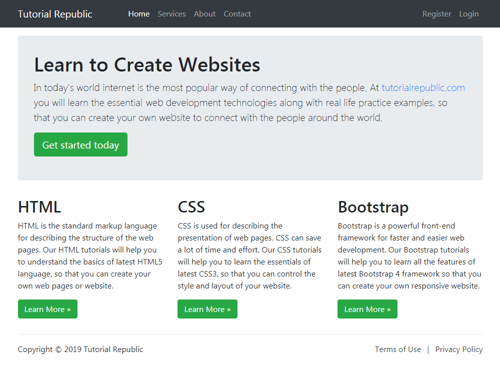
The following example will create a fixed width responsive layout that is 720px pixels wide on medium devices like tablets (viewport ≥ 768px), whereas 960px wide on large devices like small laptops (viewport ≥ 992px), 1140px wide on extra large devices like desktops (viewport ≥ 1200px), and 1320px wide on extra-extra large devices like large desktops (viewport ≥ 1400px).
However, on small devices such as mobile phones (576px ≤ viewport < 768px) the layout will be 540px wide. But, on extra-small devices (viewport < 576px) the layout will cover 100% width. Also, columns will be stacked vertically and navbar will be collapsed in both cases.
Example
<!DOCTYPE html>
<html lang="en">
<head>
<meta charset="utf-8">
<meta name="viewport" content="width=device-width, initial-scale=1">
<title>Bootstrap Fixed Layout Example</title>
<link rel="stylesheet" href="css/bootstrap.min.css">
<script src="js/bootstrap.bundle.min.js"></script>
</head>
<body>
<nav class="navbar navbar-expand-lg navbar-dark bg-dark">
<div class="container-fluid">
<a href="#" class="navbar-brand">Tutorial Republic</a>
<button type="button" class="navbar-toggler" data-bs-toggle="collapse" data-bs-target="#navbarCollapse">
<span class="navbar-toggler-icon"></span>
</button>
<div class="collapse navbar-collapse" id="navbarCollapse">
<div class="navbar-nav">
<a href="#" class="nav-item nav-link active">Home</a>
<a href="#" class="nav-item nav-link">Services</a>
<a href="#" class="nav-item nav-link">About</a>
<a href="#" class="nav-item nav-link">Contact</a>
</div>
<div class="navbar-nav ms-auto">
<a href="#" class="nav-item nav-link">Register</a>
<a href="#" class="nav-item nav-link">Login</a>
</div>
</div>
</div>
</nav>
<div class="container">
<div class="p-5 my-4 bg-light rounded-3">
<h1>Learn to Create Websites</h1>
<p class="lead">In today's world internet is the most popular way of connecting with the people. At <a href="https://www.tutorialrepublic.com" class="text-success" target="_blank">tutorialrepublic.com</a> you will learn the essential web development technologies along with real life practice examples, so that you can create your own website to connect with the people around the world.</p>
<p><a href="https://www.tutorialrepublic.com" target="_blank" class="btn btn-success btn-lg">Get started today</a></p>
</div>
<div class="row">
<div class="col-md-4">
<h2>HTML</h2>
<p>HTML is the standard markup language for describing the structure of the web pages. Our HTML tutorials will help you to understand the basics of latest HTML5 language, so that you can create your own web pages or website.</p>
<p><a href="https://www.tutorialrepublic.com/html-tutorial/" target="_blank" class="btn btn-success">Learn More »</a></p>
</div>
<div class="col-md-4">
<h2>CSS</h2>
<p>CSS is used for describing the presentation of web pages. CSS can save a lot of time and effort. Our CSS tutorials will help you to learn the essentials of latest CSS3, so that you can control the style and layout of your website.</p>
<p><a href="https://www.tutorialrepublic.com/css-tutorial/" target="_blank" class="btn btn-success">Learn More »</a></p>
</div>
<div class="col-md-4">
<h2>Bootstrap</h2>
<p>Bootstrap is a powerful front-end framework for faster and easier web development. Our Bootstrap tutorials will help you to learn all the features of latest Bootstrap 4 framework so that you can easily create responsive websites.</p>
<p><a href="https://www.tutorialrepublic.com/twitter-bootstrap-tutorial/" target="_blank" class="btn btn-success">Learn More »</a></p>
</div>
</div>
<hr>
<footer>
<div class="row">
<div class="col-md-6">
<p>Copyright © 2021 Tutorial Republic</p>
</div>
<div class="col-md-6 text-md-end">
<a href="#" class="text-dark">Terms of Use</a>
<span class="text-muted mx-2">|</span>
<a href="#" class="text-dark">Privacy Policy</a>
</div>
</div>
</footer>
</div>
</body>
</html>— The output of the above example will look something like this:

We’ve used the margin utility classes such as .mb-3, .ml-auto, mx-2 etc. to adjust spacing between the elements. Whereas the classes .text-dark, .text-muted, .text-md-right are text utility classes to adjust color and alignment of text. You’ll learn about them in later chapters.
Leave a Reply